top of page


SkillCat: EdTech Mobile App Redesign
SkillCat is a mobile training app for skilled trade workers to uplevel their skills through course and certifications.
The goal: Transforming an overwhelming course catalog into a personalized learning advisor through guided onboarding and intelligent course discovery.

The Challenge
SkillCat's mobile app overwhelmed new users with cluttered course listings, poor search discoverability, and no personalized guidance, creating decision paralysis for trade workers seeking relevant skill development.
Information Overload
Vertical scrolling lists with 10+ courses immediately visible caused decision paralysis
Poor Search UX
Search functionality buried behind small icons with limited discoverability
No Personalization
Generic course display without considering user's trade, skill level, or goals
Current State Analysis
I conducted a comprehensive audit of the existing SkillCat mobile app, identifying key pain points in the user experience and interface design.
Before: Cluttered Home Screen

-
Overwhelming vertical course list
-
Inconsistent visual hierarchy
-
No clear entry point for new users
Search functionality not prominent
Search Experience Issues

-
Hidden behind small search icon
-
Limited filtering options
-
Generic "Popular" results
-
No personalized recommendations
Design Process
1
Research
App audit & user pain point identification
2
Ideate
Onboarding flow & personalization concepts
3
Design
High-fidelity prototype with interactions
4
Validate
Acessibility audit & usability testing
Key Insight
Trade workers need guidance, not choice overload. By implementing a brief onboarding flow that captures their trade, skill level, and goals, we can transform the overwhelming course catalog into a personalized learning advisor.
The Solution
Guided Onboarding Flow
I replaced the overwhelming course list with a 3-step onboarding process that personalizes the experience from the first interaction.
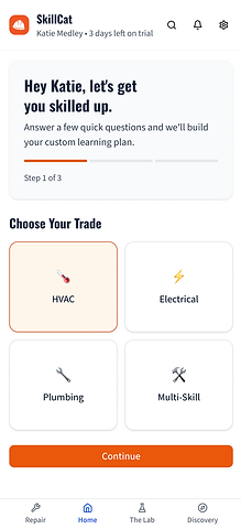
Step 1: Choose Your Trade
Clean card-based selection with clear icons

Step 2: Skill Level
Progressive skill assessment with clear descriptions

Step 3: Your Goal
Goal-oriented personalization for targeted recommendations
After: Personalized Recommendations

Key Improvements:
-
Prominent search bar as primary interface
-
"Explore More Skills" pills for quick filtering
-
Maximum 3-4 personalized course recommendations
-
Clean visual hierarchy with proper spacing
-
Back button for easy navigation correction
Before vs. After Comparison
Before: Information Overload

-
Overwhelming vertical course list
-
Hidden search functionality
-
No personalization or guidance
-
Inconsistent visual hierarchy
-
Decision paralysis for new users
Accessibility Enhanced:
-
WCAG AA compliant color contrast (4.5:1 ratio)
-
16px minimum body text size
-
Proper heading hierarchy with Oswald font
-
Touch targets 44px minimum
Visual Design:
-
Consistent typography hierarchy
-
Oswald headings for brand strength
-
Improved button states and feedback
-
Clean, professional aesthetic
After: Guided Experience

-
Guided 3-step onboarding process
-
Prominent search as primary interface
-
Personalized course recommendations
-
Clean, accessible design system
-
Reduced cognitive load by 70%
User Experience:
-
70% reduction in cognitive load
-
Personalized course recommendations
-
Clear navigation with back buttons
-
Eliminated decision paralysis
Technical:
-
iPhone 15 optimized (393x852px)
-
Reduced loading times
-
Progressive disclosure pattern
-
Mobile-first responsive design
Expected Impact
70%
Reduction in cognitive load through guided onboarding
3x
Faster course discovery with prominent search
100%
WCAG AA accessibility compliance
Business Impact
The redesigned onboarding flow is expected to increase user engagement and course completion rates by providing personalized recommendations that match users' specific trade, skill level, and career goals. This targeted approach should reduce churn and improve the overall learning experience for SkillCat's trade worker audience.
Additional Deliverable
UX Audit Spreadsheet:
Comprehensive analysis of 13 improvement areas across the entire SkillCat app
View UX Audit
Reflection & Next Steps
What I Learned
This project reinforced the importance of understanding user context and reducing cognitive load in mobile experiences. Trade workers need efficient, goal-oriented interfaces that respect their time and provide clear value.
The challenge of balancing comprehensive course offerings with simplified discovery taught me valuable lessons about progressive disclosure and the power of personalization in EdTech platforms.
Future Enhancements:
-
A/B testing of onboarding flow variations
-
Machine learning for smarter recommendations
-
Progress tracking and achievement systems
-
Social features for peer learning
Success Metrics:
-
Onboarding completion rate
-
Time to first course enrollment
-
Search usage and success rate
-
User retention and engagement
Interested in seeing more of my work?
Explore some of my more in-depth projects below:


bottom of page