Floe Health:
Building an AI-Native Healthcare CRM from Zero to One
Centralizing patient care through intelligent design - transforming fragmented workflows into a unified healthcare experience.
Sole Product Designer
3 Months Part-Time
Approx. 34 Screens Delivered
Project Overview
Floe Health is an early-stage startup building an AI-native healthcare CRM to streamline patient management and provider workflows. When I joined as the sole designer, the existing platform lacked structure and clarity, making it difficult for investors and healthcare partners to grasp its value. My goal was to transform a fragmented MVP into a cohesive, investor-ready product that clearly communicated the company’s vision and usability potential.

The Challenge
-
Revitalize a minimally designed platform with poor UX and visual design
-
Balance speed with quality to create a demo-ready product for investor pitches
The Solution
AI-assisted design process to deliver designs with new features that aid complex healthcare workflows
The Outcome
Platform used to secure investor funding and launch hospital partnerships
Project Stats
Screens Designed
34
Major Features Created
10
User Flows Developed
3
My Role & Process
As the Founding Product Designer, I owned the end-to-end design process while working directly with both co-founders and the front-end engineer to define workflows, structure the UI, and deliver high-fidelity designs that were immediately implemented into the demo product shown to potential investors.
1
Foundation
Weeks 1-2
-
Audit existing platform
-
Revitalize UI & design system
-
Map user journeys
-
Prioritize features
2
Rapid Iteration
Weeks 3-8
-
Lo-fi to hi-fi for complex flows
-
AI assisted UI generation
-
UX expertise refinement
-
Founder feedback integration
2
Refinement
Weeks 9-12
-
Polish all screens
-
Engineer collaboration
-
Demo preparation
-
Investor pitch ready
AI-Assisted Design Innovation
I developed a hybrid workflow that leveraged AI prototyping tools, such as v0, to generate initial UI elements. Then, significantly improved upon them with strategic UX expertise. This approach accelerated the iterative process while maintaining speed and quality.
Research & Discovery
Competitive Analysis
The following key competitors in the healthcare automation space were studied:
-
Tennr: Software for referral document extraction and workflow automation
-
Traditional CRMs: Salesforce and HubSpot disclose lead management patterns adapted for healthcare
-
Healthcare-specific tools: Electronic Health Record (EHR) systems, patient portals, practice management software
Key Insights
Through collaboration with the co-founders and their medical industry expertise, several insights emerged:
-
Costly drop-offs: Missed appointments, incomplete forms, and lost referrals drain healthcare systems' revenue
-
Manual workflows: Referrals still arrive via fax, requiring tedious data entry
-
Visibility gaps: Admins lack real-time insight into patient journeys
-
Trust in automation: AI-extracted data needs human validation for HIPAA compliance
-
Diverse users: Front desk, doctors, and execs require tailored views of shared data
Design System
Developed foundation through color system, typography, and components to ensure consistency and scalability
Color System
Teal/Cyan gradient palette with semantic colors for health score indicators and priority cues
Tt
Typography
Space Grotesk for headings and Inter for body text with clear visual hierarchy
Heading
Sub-Heading
Body
Components
Reusable cards, buttons, tables, and forms
Primary Button
Primary Button
Site Map
Implemented information architecture to eliminate navigation confusion and guide users through clearer end-to-end flows

Key Features Designed
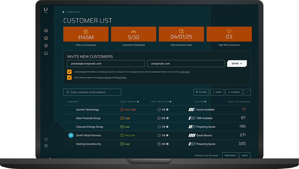
Patient Pipeline Dashboard
CRM-style patient tracking to prevent drop-offs

Design Decisions
-
Three-column Kanban layout: Referrals, Active Calls, Appointments
-
Metric cards showing conversion rates and AI actions
-
Color-coded priority levels (High/Med/Low)
-
Contextual CTAs based on patient stage
UX Rationale
Healthcare teams needed to see their entire patient pipeline at-a-glance, similar to how sales teams track leads. The three-column layout makes it immediately clear where patients are in their journey and what actions are needed.
Pipeline View
AI Automation
Priority System
AI-Powered Referral Extraction
Automated OCR (Optical Character Recognition) extraction with human review

Design Decisions
-
Side-by-side PDF and extracted data view
-
Confidence indicators for each field (98%, 95%, etc.)
-
Status badges: Extracted, Needs Review, Missing
-
Inline editing for corrections
UX Rationale
Inspired by competitor Tennr, this design builds trust in AI extraction by showing the source document alongside extracted data. Color-coded status badges make it immediately clear what needs human attention.
AI OCR
Human Review
HIPAA Compliant
Unified Communications Hub
Email, SMS, and templates in one interface
Design Decisions
-
Three-panel layout for context and efficiency
-
Tabbed navigation: Inbox, Promotions, Templates
-
Patient profile drawer with timeline
-
Toggle between Email and SMS responses
UX Rationale
Medical staff waste time switching between communication tools and patient records. This unified interface keeps everything in one place, with the patient profile drawer providing critical context for every conversation.


Unified Inbox
Templates
Patient Context
Automated Intake Forms
Smart form distribution via email, SMS, and voice
Design Decisions
-
Metric cards: completion rate, avg time, pending forms
Channel breakdown: Email, SMS, Voice
-
Patient forms table with status and actions
-
Consistent "View" and "Remind" buttons
UX Rationale
Automation was a core product priority. This dashboard gives administrators complete visibility into form performance while making it easy to identify and follow up on incomplete forms.
Automation
Multi-Channel
Analytics


AI-Powered Analytics
Natural language queries with Magic Create


Design Decisions
-
Magic Create: natural language query input
Multiple visualization types: area, line, bar, pie charts
-
Predictive intelligence with actual vs. predicted
-
Filters and export functionality
UX Rationale
Healthcare executives need self-serve analytics without engineering support. The Magic Create feature lowers the barrier to entry, while the manual option serves power users.
AI Queries
Predictive
Customizable
Additional Screens
Beyond the major features, more flows and supporting screens designed
Patient Profile
Comprehensive patient view with demographics, insurance, care history, and timeline
Full View Design
New User Sign-Up
Email verification code entry, password creation, and profile setup flow
Onboarding Flow
Return User Login
Email/password login with verification code for added security
Authentication
Patient Intake Forms
Desktop and mobile responsive forms with progress indicators and auto-save
Patient-Facing
Form Template Builder
Drag-and-drop field configuration with preview mode and conditional logic
Admin Tool
Settings & Config
Reminder timing, multiselect methods (SMS, Email, Phone), and user permissions
Configeration


Expected Impact
Measurable improvements in healthcare provider efficiency and patient care quality.
34
Screens Delivered
Delivered a complete redesign across core platform areas, transforming vision into a fully realized product experience.
Demo-Ready for Growth
Powered investor pitches and hospital demos with a clear, modern, and compelling product narrative.
100%
Clearer Product Vision
Simplified workflows and modern UI improved understanding of the product’s value.
Strategic Impact
Investor Pitches
Co-founders used designed demo to showcase product vision to potential investors
Hospital Pilots
Partner hospitals and doctors' offices began piloting the platform
Product Validation
Designs helped validate product-market fit and inform development roadmap
Brand Establishment
Revitalized UI positioned Floe as modern, trustworthy healthcare technology
Key Learnings & Reflections
What Worked Well
-
Hybrid AI-Assisted Workflow:
Leveraging AI for initial UI while applying human UX expertise for strategic decisions -
Close Founder Collaboration: Direct access to medical industry expertise ensured designs were grounded in real workflows
-
Component-First Thinking: Investing in design system foundations early paid dividends as project scaled
Key Takeaways
-
For Designers: AI tools accelerate UI creation, but human UX expertise
is irreplaceable for strategic decisions -
For Healthcare Tech: Users need simplicity despite workflow complexity, and to hide complexity through smart defaults
-
For Solo Designers: Strong design systems are force multipliers for solo designers on tight timelines
Project Conclusion
In three months, I turned Floe Health’s fragmented MVP into a cohesive, investor-ready platform that clearly communicated its AI-driven value. The redesign unified workflows, modernized the UI, and positioned the company for its next stage of growth.
Interested in seeing more of my work?
Explore my other recent projects below: